It is truly horrible how many 'so so' or just plain bad architecture and system diagrams for software there are out there.
What do we use architecture diagrams for? Do they serve a purpose or are they just eye candy? I'll elaborate on the assumption that these diagrams serve a purpose.
Architecture diagrams in general are convincing aides, to explain, to generate and answer questions.
- How do I...?
- How do you interact with our system?
- How does our stuff work with other stuff?
- How does the software map across hardware?
- What is going on...
- What are the important parts of our system?
- What parts need to go on this machine, on that machine, on certain devices etc?
- What other software stacks do we use, interact with, depend on?
- What needs to be backed up?
- etc...
We use these diagrams as sharing objects for answering questions.
- As a way of explaining the relationship between our systems and the customer's environment.
- As a tool for simply describing our stuff, which after all is digital, virtual, intangible.
- As a tool for helping to sell our products (which after all are digital, virtual, intangible).
- As a tool to help training, troubleshooting, designing, configuring etc.
However we really should acknowledge that depicting and describing complex digital technology architecture is a really really really really difficult problem! But that doesn't mean we have to continue to punch ourselves in the face with meh diagrams.
My issue is, I expect more. Perhaps it is just an issue of style. I'd like diagrams that tie in with the best policies for information mapping,using the css, themes, interface and interaction metaphors that are currently reconfiguring and improving user experiences on new digital media services and devices.
So what is possible? Who has done anything better? Have I actually ever seen a beautiful architecture diagram that ticks all the boxes? In answer to that question I am curating the following, representing for me at least, a collection of software architecture diagrams that come close to looking 'beautiful'.
Is this the real thing?
 |
| The NoUML narrative has been gathering popularity |
See the Simon Brown's NoUML notes at InfoQ or sections from the Software Architecture for Developers book by Simon Brown.
But why limit ourselves to blocks?
 |
| From a discussion on Stackoverflow |
Colour: thematic set, mixed, and complementary colours used for elements. Font: Sans serif. Connectors: none. Ambiguous message/relationship/connection. Composition: top-bottom linear, rectilinear.
Simple can be better.
 |
| A "typical e-commerce system" architecture. |
Colour: white background, black normal, red focus. Font: Sans serif. Connectors: solid, no overlap. Connector meaning is digital message/connection, zigzag denotes internet. Composition: balanced, central, radial.
A flat and simple diagram can be quite elegant and something a graphic designer can elaborate on. A single theme or style may also be employed as an in-house corporate style, tying in with the CSS for a website, application UI.
A flat and simple diagram can be quite elegant and something a graphic designer can elaborate on. A single theme or style may also be employed as an in-house corporate style, tying in with the CSS for a website, application UI.
Maybe do more with less?
Google's use of white space on its home page has spawned an appreciation for negative space in general.
Negative space is the space around and between the subjects. Stop thinking about "one big diagram", instead think of each diagram as a use-case, use it to achieve one goal rather than 20. Perhaps a simplified index diagram that opens up detailed sub-diagrams. Designers using negative space won't clutter the screen. They leave space by intention!
Colour: blue/grey background, semi-transparent elements, white. Font: Sans serif. Connectors: mixed, railway track. Connector meaning is digital message/connection. Boundary lines dashed. Icons various Composition: asymmetrical, linear, left-right.
Employ a small palette sparingly, consistently.
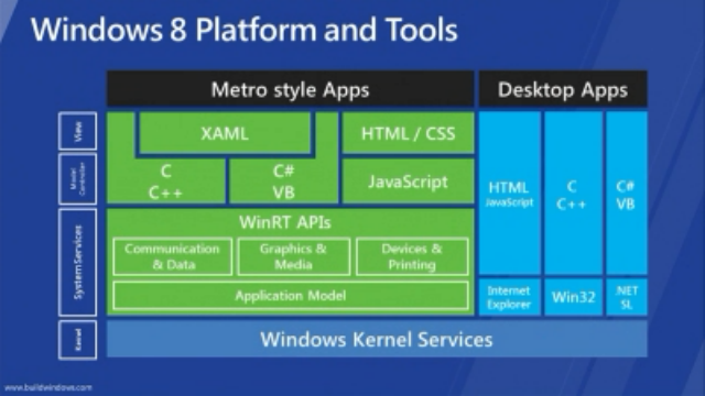 |
| The Windows technology ecosystem |
Colour: thematic set, blue background, 3 colours. Colouration used to categorise. Font: Sans serif. Connectors: none. Connection implied by position, but ambiguous message/relationship/connection. Composition: grid style asymmetrical, top-bottom, linear, rectilinear.
Flat & clean is the hallmark of the current trend in interface representation and graphic design that could seen to have started with Bootstrap from Twitter, that has influenced Microsoft's Metro interface guidelines & chrome, and even so far as to informing Apple's anti-skewmorphic post-retina display 'flat' iOS7 interface.
Flat & clean is the hallmark of the current trend in interface representation and graphic design that could seen to have started with Bootstrap from Twitter, that has influenced Microsoft's Metro interface guidelines & chrome, and even so far as to informing Apple's anti-skewmorphic post-retina display 'flat' iOS7 interface.
But don't loose the point by overdoing the beautiful elegance.
 |
| Product design + supply chain element |
Colour: thematic set, dark grey background, white and complementary colours used for elements. Font: Sans serif. Connectors: railway track style. Ambiguous message/relationship/connection. Composition: left-right linear, rectilinear.
And what happened to all that useful negative space!
 |
| A simple model of architectural constructs |
Colour: grey/dark background, alternating colouration for elements. Font: Sans serif. Connectors: dashed, no overlap. Connector meaning is digital message/relationship/connection. Composition: balanced, central, radial.